May 19, 2013

Old table

A while back in some auction, a beautiful rosewood coffee table caught Pekka's eye. On a closer inspection, it turned out to be the famous floating top table by a Danish designer Grete Jalk for one of the most well known furniture houses called France & Son. For general public, Jalk may not be as well known as some of her more widely recognised peers, but she belonged to the creative generation which placed Denmark to the top of international design in 1940s and 1950s.

As indicated by the table's name, the key design driver is a "floating" top supported by six metal rods. These structural elements are the only connectors between the top and frame, and thus create an illusion as if the large table top would be floating. The table legs, on the other hand, have a graceful round shape typical to the era. Measuring 66 x 54 x 150 cm, the Jalk table is larger than the AT10 by Hans J. Wegner we currently have in the living room, and thus it requires quite a lot of room for a given space to best compliment the table's fine features.


Great Mid-Century wood work

During the early years, in addition to Jalk France & Son managed to attract some of the most well known designers of the era including e.g. Arne Vodder, Peter Hvidt and Finn Juhl. MCM Interiors, one of our favourite mid-century websites has nicely collected some information regarding France & Son on their website, so if you are interested, please click the link above to read more.


Producer's tag

When we first saw the table, it was clear it needed some work. Even though structurally in good condition, the surface was in desperate need of love and care. In other words, this meant some quality time with the piece, once again something that Pekka did not mind at all!

Thirsty wood surface

Usually this kind of work is done down stairs in the Man cave, but as the table is quite large it was more convenient to work with it at the atrium. Enjoying the warmth and light of the Spring sun, the first thing Pekka did was to dissassemble the top from the legs.


Frame ready to be washed

Before applying a new finish on wood, it is crucial to get a rid of any old finishes including oils, waxes and silicones. There are several different ways to do this, all of them literally including getting your hands dirty.

Working with the top

Once the bare wood is exposed you have to let it dry well. Obviously, a sunny weather helps!


Bare rosewood

There are a lot of different surface finishes one could apply for vintage furniture including lacquer, oil  and wax - all of which have their advantages. Pekka usually tends to try to find out what was originally used by the producer and use the same finish.


Rosewood and teak oil

We were actually first thinking the floating table would be perfect for the downstairs lounge once it is (some day) ready, but now we are not sure anymore, as the plan regarding downstairs has evolved. Because of this, we now have another table in mind, which probably does not surprise anyone! To give this beautiful table an opportunity to find a good home, we will put it on the market, so if you are interested just drop us a mail!

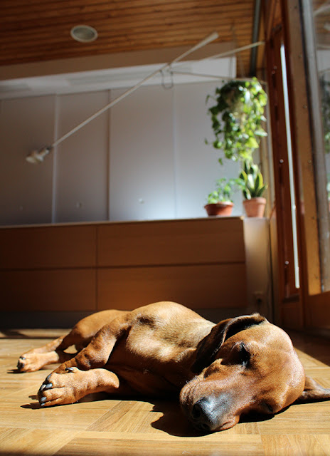
Oh, almost forgot! Also Urho has now found the atrium terrace. As he is very keen on sunbathing, during the afternoons when there is less direct sunlight inside, Urho tends to slowly wonder out to the terrace to find a warm, sunny spots that best flatters his lengthy figure.


How about some sun tan?

May 15, 2013

Thank you, Plastolux!

We would like to take the opportunity to thank you Tyler, for your recent kind words in your post titled "Mid Century modern in Finland"! Just like us, also Urho was quite thrilled, and is sending his sincerest regards while enjoying an upside down view of the world.

For anyone, who is interested in some inspirational modern interior design from all over the world, we'd like to highly recommend Tyler's blog, PLASTOLUX "keep it modern". It is without a doubt, one of our favourite blogs which both of us follow faithfully.

One delighted little sausage dog

May 11, 2013

The Atrium

It took us two years, more than twenty-five "maybe" apartments and five different offers to find exactly what we were looking for - a piece of mid-century modernism from the 1960's. Our hometown Espoo (located right next to Helsinki) is actually one the best places to find Finnish mid-century modernist residential architecture. Make sure to check it out if you are visiting the area!

In general, post and beam structure, circular staircase, windows from floor to the ceiling, brick walls, atrium yard and flat roof are features typical for mid-century modern (MCM) architecture. Among other places some of the most well known works of this era are located in the Los Angeles area and were built by The Case Study Program (1945-1966). This program is one of America's most important contributors to MCM era including the work of Richard Neutra, Charles and Ray Eames, Eero Saarinen, Craig Ellewood, Raphael Soriano and Pierre Koening, and it succeeded in producing some of the period's most important residential architecture.

These architects, together with other key players of international modernism greatly influenced also their Finnish colleagues, such as Osmo Lappo, the architect of our home. Lappo is known for his concrete architecture with a very distinctive brutalist approach.

Against this background, in this posting we would like to focus on one of the central elements of our home - the atrium. It's located upstairs and due to it's central location, it is visible from most areas of the upper floor. The atrium terrace faces south, is approximately 25 square meters in size and is defined from the apartment side by the huge living room and kitchen windows. And it is needless to even mention - we totally love it!

The atrium from the dining area


The atrium from the lounge

Looking from the backyard, the atrium terrace is well visible and defined by an overhanging wooden structure above and a semitransparent composite railing on the side. The railing has seen better days, and will thus be changed to a glass version by the condo association in due time. This is fantastic, as the new railing will allow a better view to the backyard and the nearby park.

View from the backyard

At the atrium, one can sense the proximity of the large trees standing right next to the terrace. In addition, there is an odd sensation of being part of the interior even if you are indeed outside. This is, of course, due to the large windows allowing one to se everything what is going on inside. Large windows combined with the post and beam structure is a great example of a typical architectural feature deriving from the Case study program.

Two layers of windows

One of the greatest visual effects in an atrium apartment arises when while being inside, one looks through the two layers of windows and sees back inside again. In other words, in our apartment one can see the kitchen from the living room via the atrium, and vice versa.


View from lounge towards the kitchen

Viewing from kitchen towards lounge

As the atrium terrace has been covered with ice through the winter, we have only recently rediscovered its full potential again. Even the snow is finally gone, due to other projects ranking higher on the Eisenhower grid, we really haven't done much with the terrace yet excluding Pekka disassembling and washing the composite railing.

At the moment the big question is: what we are going to do with the terrace? In its current state, it is honestly not very inviting at all. The floor, which actually is not original (information kindly provided by the neighbours) is cold and wet, and still dirty from all of the renovation work done during the winter.

Getting rid of the moss

One of the ideas was to cover half of the atrium with glass panels and attached sliding doors, but that is still under consideration. Clearly, it is the most expensive option and given all the work we still have to do downstairs its not the most appealing idea to commit quite that much money right now. Also, as we are still not quite certain what do we want exactly, it probably wouldn't be a bad idea to sleep (one more year) on it. And it still would not remove the fact that we don't like the current floor.


Cement and moss

At the moment, we would like the atrium to be an inviting, comfortable and visually pleasant area as the summer is almost here. Therefore, what we have committed to is first to cover the floor either with wood or possibly composite material, both of which have their advantages. Then, we plan to move on to furnish the terrace with some nice furniture both practical and pleasing to the eye. Of course, a process you are more than welcome to follow through our blog!

And what does Urho think of the atrium? Well, the best thing in his opinion is obviously the fact that the windows come down to the floor level. The perfect height for a hot dog!

Aah, some heat..

May 9, 2013

The secret of the Arch

At the moment, the renovation has officially stalled. All the hard work in the laundry room combined with the the staircase panel draw back has temporarily drained all the energy out of us. Therefore, now it is a good moment to do some brain work and take a moment to think about the next big move. 

Considering the season, we are quite certain the next project will be the upstairs atrium terrace, however at the same time we feel that we are tempted to kick of the downstairs challenge, wishing to take it back in time for about a century. Let's take a little peak down, so you understand a bit better what we are after. 

First, the staircase combining the two floors currently looks like a matchbox. Wood here, wood there - wood pretty much everywhere. To our taste, it is a bit too much and thus we want to get rid at least some of it. And no, this is actually not the original circular staircase. Somewhere along the way it has been changed to this what we have now. Considering the apartment's 1960's style - such a pity...

Do you prefer wood or wood?


Next, walking down the stairs the first thing one sees is a very unattractive, brown arch. This element has absolutely nothing to do with the pure 1960's modernist architecture prevalent in the apartment, and without a doubt it was build afterwards maybe during 1970´s by the previous owner. The wooden staircase, wooden ceiling, ornate doors, brown tiles, orange floor and distinct arch create an authentic 1970's atmosphere, which must have been groundbreaking a few decades after the apartment was originally build, but for us cherishing the 1960's spirit this chaos just needs to go.


The wonderful arc from top

When Pekka and Kaitsu (our trusted electrician) were working on the laundry room they had to bring new electricity cables from upstairs elecricity panel to downstairs to provide sufficient power for the washer and dryer. This was far from easy, and the only way to do it was to first try to locate the paths of the old cables in order to use their tubing for the new cables as well. And how do you do it? Well, you guess and drill a hole. And hope you hit the correct spot with the first five tries! While taking wild guesses, also the arch got hammered a bit as it was found to contained a cable path. Inside, we made quite an interesting discovery!


The secret of the Arc

What was discovered was an old newspaper, Helsingin Sanomat, with the date (1.12.1979) matching perfectly with the colouring, materials and the style in the downstairs.

Valintatalo and Ajatar - after 30 years, still in business!

News from December 1979

So after this discovery, we feel even more justified to get rid most of the downstairs surface materials to be able to take it back to the 60's, just like we have done in the upstairs. Of course, the project "Downstairs" will not be limited with just updating the surfaces - not surprisingly, our plan is somewhat on the ambitious side, but fortunately, we are not in a rush. And rest assured, when we have a final decision, we will be glad to share the detailed plan with you!

May 4, 2013

Kitchen 100%

Since there are so many projects ongoing at the same time, and thus several topics to write about, we realised that not all fully completed projects have been formally closed off here as well. One of these is the kitchen, which has been finished to the last detail for some time now, but we have not shared the end result with you. There are at least three things which has not been discussed: the extractor fan, Corian handles of the sliding doors, and the fluorescent tubes above the work top.

The extractor hood posed maybe the greatest challenge in the whole project. As described in "Kitchen assembly, day 2", we wanted to hide it behind sliding doors. The extractor hood we chose was originally meant to be attached to the ceiling in a horizontal position, but in order it to work in our design, it was positioned vertically. Not straightforward at all. But comparing the end result (above) to the original "golden" hood (below), we were extremely pleased. When the doors are open, the light of the hood creates a very modern, almost futuristic look, and when the doors are closed, one is able to basically forget the hood's existence.

Experimenting with an extractor hood 

The old "golden" extractor hood


Originally, we thought the sliding doors would not need any handles, but after a very short time it was evident they needed to be added. It was difficult to move the doors as fingers just kept slipping on the surface. The handles were made to measure according to Pekka's 3D-modeling and milled out of a solid block of Corian with a CNC milling machine. Corian was chosen in order to match the material aesthetics with the countertop, again aiming for a lowest possible number of different elements, along with the lines of reductionist principles. 


Corian handles


Milling of Corian handles (click HERE to see a video)


As the kitchen has no traditional cabinets on the wall, there is no space to attach sufficient working light needed. Therefore, a boxed compartment for additional lighting was built. However, as the ceiling already hosted some old Orno lights we wanted to hold on to, any kind of newer led spots would have posed a conflict both in terms of style and positioning. Thus, we ended up with a very anonymous solution, simple fluorescent tubes. The trick is that when they are off, they do not stand off at all, but when they are turned on, they provide ample of light for whatever purpose needed.


Last but not least, we would like to take the opportunity to thank Puupalvelu Rajala for the superb job done! Our made to measure kitchen designed by Pekka is not something you can just go and order from any contractor, but a project of this scale requires a partner with an adventurous attitude, extensive craftsmanship and experience, and above all, patience with a customer who is constantly refining the design. It is not only that we love the looks and the quality of our kitchen, but have also found it complementing our needs very well. Altogether, we could not be happier with the end result!

May 2, 2013

Sticky surprise

After a finished project there is always another one waiting. While seeking for the right materials for the upstairs atrium terrace, we wanted to get rid of the paneling covering the walls around the staircase and paint them white. The ceiling, again, will remain as it is.

When Pekka started pulling off the panels (which we thought would be attached only with nails), he made a discouraging discovery. In addition to the nails, the panels were glued to the wall as well. So with every panel coming off, there was a tenfold increase in the amount of work. Four walls, lots of panels and many, many litres of glue. So yes, this one will take some time to be finished.

Just how many hours are we looking at?

May 1, 2013

Ready to wash!

Project "Laundry Room" has now been completed! For those who have not followed the laundry room project from the very beginning, here are the links for previous postings: part1part2 and part3, just in case you want to check those out as well.

We aimed to a functional, but also an inviting space (as the room also goes by the name "Minna's office", and it is a known fact that the efficacy increases in a positive working environment). We also wanted it to be aligned with the colour palette in the rest of the apartment, those being black, white and wood. Below, there are some "before" and "after" pictures from two different directions.

View from the door - after

View from the door - before

Mirror and sink area - after

Mirror and sink area - before

Together with the wooden suspended ceiling, the indirect light above the sink, in the back end of the laundry room and under the cabinets create a warm, inviting atmosphere. The long work top is very practical in sorting and folding laundry, and the cabinets have space for linen and towels. The shelfs for e.g. different towels, pillowcases and duvet covers are marked with Minna's beloved Dymo, just to make it easier for all users to easily locate whatever they are looking for.

Worktop and cabinets

Suspended ceiling hides most of tubing

As you might have spotted from the very first picture, a ceramic bird designed by Lisa Larson for Gustavsberg in 1960´s has also landed in the laundry room! We chose this particular bird of the three options, as its colours complements the laundry room the best. The two more colourful pieces, Kukko and Kana, are located upstairs in the living room.

Ceramic bird