Pages

Sep 21, 2014

Slate floor - check!

We are very happy to announce that the downstairs slate floor is ready including everything from the floor heating to the protective coating. And what's better - all systems tested and working perfectly! Naturally, we are very pleased as the process has been exahaustingly long and extremely dusty. But in the end, the outcome matches the vision quite well.

However, the lounge area still misses a few "minor" details such as the teak slat wall and its indirect lighting, finalization of the electrical work, central heating radiator, three inside- and one outside doors, window, lights, furniture, rug and appliances. And no, we have paid absolutely no attention to the downstairs quest room at this point.

Slate floor, completed! 

Back to the floor itself. One of the most labor intensive phases in the installation was to give floor the appropriate final finish, basically meaning sanding. This is actually something which is not an absolute must, and thus not something everyone might choose to do, but we felt that it was crucially important as we wanted to get rid of all the edges in the rock and smooth out the surface of the filler in between.

Sanding in a dust cloud

This didn't however mean we wanted to remove the texture of the slate. Quite the opposite. The texture was something that we wanted to keep, as together with the color and form factor, it is one of the key characteristics why we originally chose this type of slate in the first place. So the purpose of sanding was to remove the sharpness from the rock. When walking bare foot some roughness and variation is fine, but sharpness is certainly an unwanted feature.

Texture retained

Once the floor had been sanded with a big machine Pekka insisted on doing another round manually. Rock after rock he went through the entire floor ensuring that the smoothness of both the slate and filler was at an acceptable level and the graphical sharpness between the filler and slate was crisp.

Sanding by hand

The tool Pekka used for the manual work was a little sander by Bosch. It worked perfectly, as with 80 grit paper it managed to attack both slate and filler just with the right force. Well, the motor did break half way through the process, but the guarantee took care of it, after which he was able to successfully finish the job.

Pekka's little helper

All in all we are very happy with the outcome regarding the slate floor. Once more, a big hand for Liuskemestarit who provided the material and took care of the installation. We will return to them next summer when we continue the never ending downstairs / backyard story and start the garden work including the construction of a 45 square meter slate terrace on the back of the apartment.


All set!

Currently, downstairs provides a place for certain pieces of furniture that have been either stored away ever since we moved in two years ago or have been used upstairs earlier. Actually, some of these pieces are fore sale so if you are interested please visit the market to take a look. Perhaps one of these MCM pieces has your name on it! 


Temporary downstairs furniture

Of course, Pekka has already developed an interior concept for the downstairs lounge layout including furniture and lights. As soon as he will find the time, he is thinking of shooting a few renderings in order to visualize the idea for all of you. But no rush. One thing at the time...

Sep 20, 2014

Teak slats

If you have been following the teak slat wall saga, we have some news! Since last winter the planks have been stored in a pile in the darkness of the bunker, but now finally the time has come to move forward with the project! (And if you have no idea what we are taking about please review the previous posts: 1, 2, 3.)

Again, the job was to be done in the same place than last time, the architectural wood workshop of Aalto University located close to our home.  But at the brink of the very first cut, Pekka found himself hesitating. Even if he had given some serious thought for the design, when about to slice the first perfectly beautiful, massive plank of teak his mind started to wonder: "Should I reconsider the final design once more? If I make this cut I have passed the point of no return..."

The first set ready to be processed

After these fleeting moments of hesitation, when the very final decision was made, he was ready to roll. The first thing was to push the planks through a thickness planer in order to gain geometric purity. This was followed by processing the planks with first a jointer, then a circular saw and eventually once more a thickness planer. Overall, this stage took about two working days.


Coming through!

One plank ready for jointer

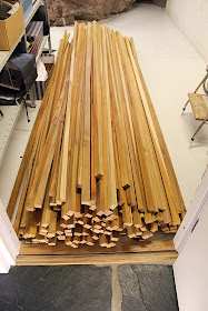
Based on our calculations we needed somewhere around 160 slats to cover the 5.5 meter wall downstairs. However, to have a possibility to choose between different pieces at the installation stage, altogether around 200 slats we made. This required slicing of 21 planks of beautiful teak to slats with predetermined cross section dimensions of 22 x 30 mm.


Exactly 200 pieces

Even though the slats were planed in the previous step their edges still remained sharp. Therefore, all of them needed to be hand sanded with a 240 grit sand paper to the direction of the grain. Based on the his experimental observations Pekka had made earlier this was an adequate smoothness for this stage. After sanding, the slats were cleaned with pressured air in order to get rid or all the dust particles. Only after this, they could be treated with oil and turpentine mixture.

50% Tung oil - 50% Turpentine

The first set of 20 slats has now been treated with a mixture of Tung oil and turpentine for the first time. An unavoidable side effect is of course a horrible smell of turpentine invading also upstairs (oh well, at least it is not construction dust which would mean an extra round with a vacuum cleaner). Once the slats have dried they will be rubbed with steel wool and retreated with a few layers of pure Tung oil. The most crucial thing here is to be patient in order to allow sufficient drying time for Tung oil. But it certainly will pay off, as one day all this extensive processing will result in a stunning teak slat wall inspired by the MCM era. Great!

20 out of 200

We have also made a decision regarding the actual construction of the wall. It will be a sandwich construction of nine modules, consisting of teak slats in front, acoustic panels in the middle, backed up by sheets of plywood on the very back. This allows us to attach the slats in place with screws from behind, leaving the screw heads invisible to the eye. We have also made some research regarding the acoustic panels and have managed to find an excellent material provider from Finland. More about this very soon!

Teak slats

Sep 10, 2014

POP by Jaana Karell

Long before we had even found a new circular staircase (when the space still looked like a match box), the idea of the future wall decoration and related lighting already existed. As the back wall is quite spacious, we wanted the decoration to be something quite prominent, yet elegant and timeless, something which would again complement the original spirit of the apartment.

For once, the choice was not difficult. We both really love the look and feel of the POP panels designed by Jaana Karell (www.karelldesign.fi) and produced by a Finnish company Brainwood. These stunning wooden panels can already be found in several prominent locations such as Google and Microsoft in New York, Disney Studios in Hollywood, CNN in Atlanta, Federal Trade Commission and Hard Rock CafĂ© in Las Vegas. And finally, also now in our home!


POP panels by Jaana Karell

Jaana Karell is a Finnish designer who specializes in wood. She collaborates with various companies both as a consultant and by designing her own collections. Jaana and Pekka actually used to study in the same design school back in the 90's and thus go way back in time.

Since she was on a third grade, Jaana has been keen on carpentry. She loves using wood as a raw material in her designs, and the haptic aspect of wood is often strongly emphasized in her work. She finds that even if flat and clear surfaces are often preferred by designers, sometimes the essence of wood can be cleverly accentuated by the design of a given piece. For example, POP panels feel very soft to touch, so in addition to being visually appealing, the haptic experience is also very pleasant.


POP panels connecting the two floors

According to Jaana, in the development of POP panels the leading driver was to bring the designer's vision into reality. The original idea revolved around a timeless piece with a 70's feel, which she was keen on creating, even if the initial response from manufacturing companies was that it couldn't be done. "The bubbles edge is too sharp, the shape is not going to hold, the plywood will rip from the middle or that the ring shape around the bubble is not going to work" were some of the objections she faced. Therefore, she took action and made the molds for the prototypes herself to test the idea. Subsequently, one manufacturing company agreed to conduct a set of test presses if she would be able provide them the molds. So even if she was a student at the time, she paid the expensive molds from her own pocket and yes, the rest is history.


Box of teak panels

POP panels are commercially available in three different wood finishes: birch, cherry and walnut. Yet none of these materials, however, quite fit our home (we tend to be "teak people"). Also we are  constructing a teak slat wall downstairs, so the panel solution needed to meet these specific needs.

This is when the big idea of producing a custom panel set with teak was born. Again, we turned to the best source for veneer here in Finland: Janne Kuokkanen from Hollolan viilu ja laminaatti. Janne agreed to provide the suitable teak veneer for Brainwood, so they could produce the very first prototype set of teak panels. At this time, no one knew how well teak would settle in this particular form.

POP panels fresh out of the box

A bit of time passed, and after a seemingly long wait we received a shipment of thirty teak panels, both with curved and flat profiles. It is not an exaggeration to say it was love at first sight. With the teak veneer they had turned out perfect!

The panels arrived with an intelligent railing system made of extruded aluminum to be used as a wall fixture. According to Jaana the way the panels were to be fixed on a preferred surface played a critical part in developing process of the POP panels. The system needed to be invisible and seams in between the panels were designed to be as clean and unnoticeable as possible.

Aluminium profiles

Fixing the panels to the wall is very easy. Of course, it is important to start with a well leveled row of panels. Here again a laser proved indispensable to get the first aluminum profile perfectly horizontal. Once the profile is fixed, you simply place the panels on top of the rail. After this, you fix the next rail on top of the row of panels and keep repeating this until you reach the desired height.


First row up

Following the installation instructions, the system is really straightforward and fast to work with. The only real challenge for us was the height of the staircase (about six meters). It was a bit difficult to reach the upper rows, but with some previously practised ladder acrobatics Pekka succeeded to fix even the top row nicely in place.


Fully assembled set of panels

A charming curiosity absolutely worth of mentioning is the potential optical illusion of the POP panels. Sometimes a viewer might be a bit confused whether he or she is looking at a convex or a concave shape. In our set up, we wanted to light the panels from the side to enhance the 3D experience. For this, the adaptability of the Flos Parentesi lights proved to be quite ideal.

Pop & Parentesi - simply a perfect match

The POP panels are available in Finland via Brainwood and in USA via HighTower. Also, if you happen to be in Helsinki during the next five days, and are thinking of visiting the Habitare Furniture/Interior Decoration/Design Fair (10-14 September 2014), make sure to check out the POP panels at booth 7P67.

In their simplicity, the panels are really unbelievably beautiful. Needless to say, we just can't get enough of them.

Sep 8, 2014

About Visions

This post will be completely unaligned with our usual style. First, there will be no visuals. Second, it does not concern a concrete step in our never-ending renovation saga or describe an interesting restoration project. Third, it is not a collaborative effort as our posts usually are but written by Minna alone.

This post is about respect for those who are truly visionary. And perhaps even more importantly, respect for those who are passionate and determined to go for their vision and make it real.

Indeed. Vision – strategy – implementation. A trilogy recited to the point of exhaustion in strategic planning.  I don’t think there is anything interesting or exceptional I could add to this well-analyzed framework. But during the past two years, I have made some Project Olive Green Window related observations, a bit of food for thought. Guess one could also call them learnings.

First, it really seems to be true what is said about realism: it is the worst enemy of creating an appealing vision. It is not often easy to let one’s mind to fly unrestricted. One should also be able to imagine having pockets as deeps as a millionaire’s and a mind as powerful as Neo’s, who was able to modify the matrix at will. Anything less will result to a poor outcome and should be discarded as “suboptimal”.

Second, it is not a single strategy that can lead to a successful end result. Strategies should be flexible and adaptable. It is fine NOT to have all the answers at the starting line. And NOT every single corner needs to be polished and fine-tuned before the kick off. A general strategy outline is very often more than sufficient. Really, NO need to be perfect.

Finally, successful implementation resolves around three basic things: confidence, patience and extremely hard work, which will eventually enable almost anything. Very few of us do indeed have the pockets of a millionaire. Many have a tendency to expect too much in an unrealistic schedule. And even fewer are ready to commit to the countless hours of work – always, always add a zero to the end and you might get close to what is really required. But smart choices made at the right time combined with sweat and occasional tears forms the recipe that pay’s off in the end. And the driving force, the true source of energy, is of course the vision often regarded as unrealistic at start.

But most of all, one should have no fear. Fear for “Aiming too High”, fear for “Facing Problems or Frustration”, or fear of “Failure” are just a few examples of the innumerable silent killers, which efficiently suck the life out of any promising project. And usually they come in so well disguised that the poor mind lacks a proper chance for a fair defense. Instead, crazy and unrealistic is the way to go. That is, if you want to make extraordinary things happen.

And finally, perhaps the most important learning: I am really not one of those fearless, visionary people. Quite the contrary. But I am honored and lucky to share a life with one.

And needless to say, I am thankful for every single minute.