Pages

Mar 31, 2014

Hu Huu!

In a few months, our little daughter will be two years old, and watching her grow has been just amazing. Lately, the primary learning focus has been on communication, and the speed she is picking up new words is close to exponential. Not surprisingly, animals offer an intriguing source of inspiration for her. She is very quick to learn their names and what kind of sounds they make.

Last summer we got her a pair of rubber boots with pictures of owls all over them. That was simply love at first sight. Those boots go by a name "Hu Huu" (eng. "wo hoo") and she still insists on wearing them on a daily basis. Ever since, she has also been pointing out all the possible owls in TV, magazines and books. Practically, no owl can escape Sofi's radar.

A bird just flew into our house

Inspired by Sofi's exhaustless interest on owls we were not able resist when Pekka ran across a very special item in a internet auction a little while ago. It is ceramic wall plate, designed in 1960 by an artist Raija Uosikkinen (1923-2004) for a Finnish manufacturer Arabia. With dimensions of 295 x 295 mm and weight of 2.6 kg, this intriguing mid century wall piece features a hand drawn picture of an owl. The plate is actually part of a larger collection called "Linnut" (eng. "Birds") illustrating a series of different birds such as an eagle, a capercaillie, and an owl grouped with other bird species.


Hu Huu!

The plate has been signed by the artist in the lower right corner next to the manufacturer's name. During 1947-1986, Uosikkinen had a long career at Arabia working as a decorative artist and collaborating for example with such characters as Kai Franck. One of her most famous creations is the Kalevala collection.

Designer's signature

Manufacturer's label and the series numbering

This beautiful hand painted illustration is full of fabulous little details and thus definitely worth taking a closer look. The dark cobalt blue combined with the lighter blue accents works perfectly against the white background. For now, we just hang it on the kitchen wall to keep it safe, but with time we want to find a better location and complement our house owl with correct lighting.


Hand painted details

So let's see how enduring Sofi's fascination on owls turns out to be in the long run. At the moment, the ceramic plate is just another painted animal feeding her imagination and boosting learning, but perhaps with time she also grows to appreciate the artistic attributes of her Hu Huu. Actually, it could be much sooner than we think. After all, these little people have proven themselves as extremely fast learners!

Oh, and already on the first night when the owl arrived, Sofi did not forget to wish Hu Huu a good night before going to bed. Ranking quite high on the scale importance, isn't it?

Mar 29, 2014

Pop the Grain

Spring has arrived! Well, at least that is what we'd like to think, but honestly in Finland at this time of the year you never really know for sure. As it might snow again the next day you just enjoy the sunny moments and let the pieces fall as they may...

While enjoying the sun and waiting for the city inspector's approval for the downstairs steelwork required before the next step, we have targeted our energy to the slat wall project. After extensive analysis and prototyping, we have made a decision to freeze the measurements of each piece to 22 x 30 mm. Finally, for Pekka's great delight, we have started experimenting with some real teak samples with the correct cross sectional dimensions.

As described before, quite coincidentally and conveniently, we managed to source this exquisite material grown in sustainable manner in Costa Rica. And based on our experience, we are very happy to recommend them further. For more information please visit www.tiikki.com where you can contact the owner, Tapani, directly. He is a very helpful person always willing to help teak-lover with both smaller and bigger wood-related needs. 


Teak piece preview

Before continuing further - please bear in mind one fact. The word "obsession" falls far from describing Pekka's feelings towards his beloved pile of teak downstairs. Therefore, please understand the level of detail in the following description, he just wants you to share his excitement.

So, how were these awesome slat samples made? Well, considering the note above, the first (mental) obstacle for Pekka was that he needed "do harm", in other words to cut a piece off of his beloved wood. Subsequently, a kind technician at the architectural department of Aalto University helped him to take the test block through several wood working machines to produce slats with the correct size.


Test block


The Kind Technician

After handling rough planks of wood with surfaces exposed to the normal transportation wear and tear while arriving from Costa Rica to Finland, it was finally exiting to take a deeper look in to the grain. When the wood is cut, one can already get an idea of how it will look when finished.

Freshly cut blocks

It is not uncommon that freshly cut teak exposes a slighty greenish tone within the grain. If this were to happen for your beloved teak pieces, there is no need to worry - the green shade will relatively quickly turn into a beautiful brown tone when the wood gets exposed to UV radiation from the sun light. Untreated, the wood would continue changing color from brown to grey - a situation, which is quite familiar for those who do not choose to treat their teak-made garden furniture annually.

Teak with a greenish tone

After the pieces were the correct size, Pekka sanded them with a sandpaper starting from 240 grit and in some cases proceeding even down to 600 grit. The goal of testing with different roughness was to provide insight on what to do in a larger scale when the time comes. With these samples we wanted to try optimise a lengthy process as much as possible in order to avoid any extra work and material loss later on.  

Sanded test pieces

Testing early with different grits is important, but the main reason for cutting the test pieces was to have a possibility to conduct experiments with various wood finishes before committing to treat the entire slats wall to be.

Over the years while restoring vintage furniture Pekka has gathered a nice collection of different wood finishes. Now, when wanting to find the perfect sheen he will, inevitably, end up testing them all. Most of the finishes he has are different types of oils, e.g. the pure Tung and Linseed oils, combined with either Teak and Gun Stock Oil, the latter two being actually oil based blends. Last but not least, just out of curiosity, he will also try a wax finish on one of the test pieces.


Variety of oils and waxes

Applying oil on bare wood can be tricky, and it is recommended really to study the process before starting. Especially the pure Tung Oil requires close attention, as being a rather thick substance, it can be difficult to spread it evenly on large surfaces. Some suggest to blend the first layer of oil with mineral spirits or turpentine up to 50%. This will make spreading the oil over the wood easier, and a thinner liquid will also penetrate deeper into the grain providing better long-term protection. 

When dealing with oils one of the most important things is to remember is that its always better to rely on several thin layers rather than one thick one. Put some oil on a clean cloth and apply on wood. Leave it for about 20 mins, and subsequently wipe off the remaining oil. Remember, you are not aiming for an actual film, but rather an ultra thin layer supposed to penetrate the wood. After that leave the piece to sit for 24 hours, rub it with ultra fine steel wool (0000) in the direction of the grain and repeat the oil treatment. It is not uncommon that up to 5-10 layers of oil are needed in a search of a good protection and perfect sheen.


50% Tung Oil - 50% Pine Turpentine

And this is when the popping (ref. to title) starts to happen. It is amazing how the oil makes the grain "pop" giving the wood a bit of a wet look bringing out the different colors of the grains, eventually giving the material that luxurious sheen very familiar from several MCM furniture pieces.


Untreated vs. Treated 

Typical to Pekka, when it comes to exaggeration he is sometimes found guilty of, this part of the project brings no exception. As the Man Cave downstairs is out of use for obvious reasons, our bookshelf in the living room is slowly being populated by teak samples drying between the layers. And yes, the Tung Oil does smell when wet, but what can you do, we are all very familiar with the slogan about beauty and suffering.


Samples 1 - 6 with different types of finishes 

Every now an then we like to wrap up posts with a picture of our beloved sausage dog, but while the teak piece photo shoot, Urho was for some reason not interested what was going on and thus not around. In these situations if you for example would kindly request him to model fore example, it  might be a good idea to check out our bedroom and lift the covers of Urhos "basement". Nine out of ten times (just like this time) he will be found wrapped underneath an extensive number of blankets that smell like - well, a dog. 


Do Not Approach

Mar 22, 2014

Katinpoika

We are pleased to announce Sofi's room is now safe and liveable! Not finished, by any criteria, but all the junk belonging somewhere else has been carried away - well, somewhere else.

While transforming the room to suit the needs of the little person living in it, we also decided to move Sofi from a crib to a baby bed. First, instead of needing to pick her up in the middle of the night and carry to our bedroom, she can now just walk herself - quite practical. Also, a bed just looks so much nicer than a crib. So what a wonderful opportunity, once again, to develop a slight obsession.

We first had our eye on an extendable Jolla-bed by Muurame, but when looking for an used Jolla, we came across another Muurame bed called "Katinpoika" (freely translated "Kitten"). Like Jolla, it is extendable, but has a design we preferred much more over Jolla.

Muurame Katinpoika


Muurame is a Finnish family owned furniture company with a long history of producing modular pieces with a timeless design suitable for a wide range of uses. The dawn of the modular collection dates back to 1954, when Pirkko Stenros had her first child and subsequently started designing modern, minimalist children’s furniture. The first piece was a child's bed (called Jetti) soon to be followed by some modular drawer units to serve originally as night stands.


Muurame label

Since there is actually very little information available online about Katinpoika, we would like take the opportunity to share some of it's history (information kindly provided by Muurame). The first bed Stenros designed for children was a full-sized bed, but when it was time to move her third child from a crib to a bed, she wanted something more "nest-like", which could then grow with the child. After the second world war, there were no extendable beds available for small children in Finland and thus in 1960's, she started designing one, later to be known as "Katinpoika".

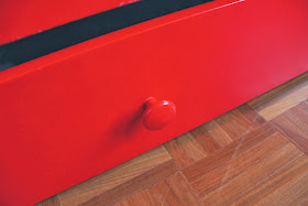
Drawer button


Katinpoika, made of massive wood, was in production during 1971-1981. Eventually, it was part of an extensive product family, which included several different kind of beds for grown ups and children, night stands, seats, cupboards and even some toys. The two original colour options were white/red and white/blue, followed by a later addition of white/yellow, when parents wished for a gender neutral colour.


Oh the stories you could tell!

Up until today, Sofi's Katinpoika has without a doubt served several kids, and one can see some marks of years past here and there all over it.  However, the overall condition is very good, as Katinpoika bed was originally designed to last for many, many years. And really, we don't mind. Quite the contrary, we do love how these old pieces of furniture have a story to tell.


Perfect for storing toys


And yes, Sofi will add a story of her own, most likely very visible one, in the form of a marker, sticker or something else more or less permanent by nature. She is fascinated by her new bed, and every night she remembers to make a point how she is going to sleep in her "uus" (=new) - the "bed" part of her vocabulary still missing. But like her stories, the missing words will come, sooner or later. In the meantime, she is happily enjoying the early rise of her own queendom, still for a while missing a "Do Not Enter" sign at the door...  


Shall I go with a raccoon or a butterfly?

Mar 16, 2014

Going deeper

For those who prefer renovation over design, we have good news. Project "underground" is ready to take the next step. Last Friday, the Big Tools arrived over the second time, and sliced through a concrete wall once more.

Like you may remember, approximately half of our downstairs (60 / 120 m2) is in use, consisting Pekka's man cave, sauna, bathroom, laundry room and the lounge to be. The other half underground is basically a crawlspace just hosting for example heating and sewer tubing etc. As we seem to be in chronic shortage of storage space for diving gear, tools and other necessary nicknacks, we want to convert this unused space to a large and smartly organized storage area.


Sliced concrete

The first opening to enter the underground space was done last fall, followed by a sweaty and dusty weekend during which a group of dear friends helped us to empty the first room filled with rocks and construction junk.  Now with the appearance of the second opening to the next room we can start clearing the second space from any unwanted material.

Our goal is to complete the "dirty work" before the downstairs lounge will be finalized, as all the underground junk has to be carried with wheel barrels through the lounge area. Now it can be done without needing to protect the floor and walls, as none of the surfaces are finished yet.


Two openings to the underground world

It took two and a half professional working hours to slice through the concrete with a diamond blade. Yes, like always we did warn our neighbors beforehand, as the sound of the diamond blade resonates through one apartment to another very well, and might not be the most pleasant sound to wake up for on a random Friday morning.

Before & After

The effectiveness how a diamond blade cuts concrete is amazing - one could almost compare it to a table knife cutting through soft butter. The concrete is not steel reinforced as can be seen in the picture below, but rather has stones and sand mixed in with the blend.

Sliced concrete

So what treasures lie behind the opening? Well, the most exciting aspect is the amount of junk. The second space is actually a bit larger than the first one (both combined about 45 m2), but fortunately is not nearly as full as the first one was. This time there are no large pieces of rock from the construction phase blasting work in the sixties, but rather some old construction materials such as tubing, insulation, wood and bricks, and some organic matter which once grew on top of the solid rock our apartment was built on.

The second room


Tubing


Bricks

But as always, there is of course a "BUT" in all of it. This time it is large and solid, and inconveniently located in the first room passageway: a huge rock formation exceeding the level of the future concrete floor. Urho, the smarty assistant, is kindly indicating the piece of rock which needs to be removed before we can start emptying the second room (photo below). Otherwise the ride for a wheel barrow might be a bit more than bumpy.

So if you are now thinking of expansive mortar - yes, you would be absolutely correct.


May I just point out one thing: you guys are nuts!

Mar 1, 2014

Slat wall

Let's face it. The idea of using wooden slats as decorative elements is not new. On the contrary, they have been widely used in interior design and architecture. A good example is Eero Saarinen's (one of our favourite designers of all time) work conducted for the General Motors HQ in Detroit Michigan. Among other things, he was asked to design the office interiors of Harley Earl, who at that time was the Vice President of Design at GM. The three other examples are more contemporary, yet relatively similar visually: 23 and 4.

So very early in the process we knew we wanted to use some kind of wooden elements downstairs. First, Pekka made a slat ceiling to the laundry room. In terms of the downstairs lounge area, we were first contemplating wether to use plywood or not, but when acquiring a 1.65 m3 pile of solid teak which now lies in the underground space waiting for to be used, our minds quickly shifted from plywood to slats.


Quick prototyping with a ceiling element from laundry room

After choosing slats the question became whether approach the challenge with a horizontal or vertical pattern. Then, the thinking revolved around the dimensions of both the wood pieces and gaps in between. It is this rhythm in relation to the scale of the entire wall that matters and ultimately defines how well the slat wall will complement the entire space. 

As you can guess, these monstrous questions are driving Pekka over the edge. So during the last few weeks, he has been relentlessly working with prototypes made of pine. Via seemingly endless continuum of prototypes he has slowly started approach to the "perfect" design. It will take, however, a few more iterations and some more pine for him to find the absolute optimal rhythm. Only after that he will freeze the design and is allowed to start experimenting with his beloved teak to produce the final pieces (yes, he really goes and talks to the teak every night).

Early slat prototypes

As it is by trial and error, in order to be able to experiment with exact measurements Pekka of course made some tools to create gaps of various width.

Gap tools

Currently, thanks to Pekka's determination, we have answers to most of the questions. The slat elements will be layed vertically, from floor to ceiling. The cross sectional dimensions of the latest pine prototype is 22 x 22 mm attributable not only to the visual drivers, but also to the dimensions of the original teak pieces. So each piece would be 22 mm wide followed by a 14 mm gap. Naturally, the ratio of 22:14 is very close to the golden cut.

Testing with a ratio of 45:15

We are also planning to use teak to finalize the steps of the circular staircase. This will not only add warmth visually, but also has a more functional aspect. Without any coating, the steel steps are a bit slippery and to avoid any unwanted accidents adding wood might not be a bad idea.

Horizontal design

This will evidently lead to some design decisions as there are many ways in which the pieces could laid on a step.

Vertical design

Anyhow, back to the slat wall. In the end, we decided 22 mm is visually still a bit thick, so the next step is to experiment with 20 mm. Shall we see the day of the design freeze, before installing the slats the entire wall will be covered with acoustic panels. The slats will be installed on top of the acoustic element. Therefore, it will not only be a visually appealing end result, but the wall will also function as a sound trap. More to follow for sure!


Latest mock-up